Is Your Website Mobile-First Ready? The Complete Mobile-First Indexing Checklist for 2026
If you're learning SEO right now, you've probably already heard the phrase "mobile-first indexing" thrown around in class or in a YouTube tutorial like it's some old, settled topic. It isn't. Google has been using the mobile version of websites for indexing and ranking since 2024, but a huge number of small business websites in India — the kind you'll actually be auditing as a junior SEO executive — are still running on desktop-first thinking. Tables that break on a phone screen. Pop-ups you can't close with a thumb. Menus that take three taps to find. None of that is a "design issue" anymore. It's an indexing issue, and it's costing real businesses real traffic.
This is a practical checklist to help you check a website quickly (within 15 minutes) while giving you context so that you can understand why what you are checking is important. This is for students preparing to interview with clients, freelancers auditing client sites, and business owners who want to understand why their competitors rank above them when their content is less informative than theirs.
What Mobile-First Indexing Actually Means (In Plain Language)
Mobile-first indexing means that Google will use the mobile version of your website (rather than the desktop version) as its primary index source for how to index and rank your pages. Google does this by crawling your site using a smartphone user-agent to view it as a phone would, which means that whatever the crawler sees will determine how your site is ranked and how it is displayed in search results on both mobile and desktop devices.
The important part for beginners: this isn't about whether your site "looks fine" on a phone. It's about whether the content, links, and structured data that exist on your desktop site also exist on your mobile site. If they don't match, Google may simply not know that the missing content exists at all — because it's not looking at your desktop version to find it.
According to Google's own documentation on mobile-first indexing, the mobile version should carry the same primary content, structured data, and metadata as the desktop version. That single line is the foundation of almost everything in the checklist below.
Why This Still Matters for Small Indian Businesses in 2026
A lot of small business websites built in India over the last several years were designed desktop-first and then "made responsive" later, sometimes by hiding sections, shrinking tables into unreadable text, or burying contact details inside a hamburger menu that takes too long to load. None of that was a problem when desktop ranked the site. It's a direct ranking liability now.
For local businesses — clinics, coaching centres, boutique stores, service providers — this matters even more, because most local searches happen on a phone, often while someone is already standing outside a shop or comparing options on the move. If your mobile page hides your address, phone number, or service list inside a collapsed menu that doesn't load properly, you're not just losing a ranking signal — you're losing the customer.
This is also exactly the kind of audit work that comes up early in an SEO career. If you're a student or someone transitioning into digital marketing, knowing how to walk through a mobile-first indexing check — and explain it clearly to a non-technical business owner — is a practical skill that shows up in interviews and on the job from week one.
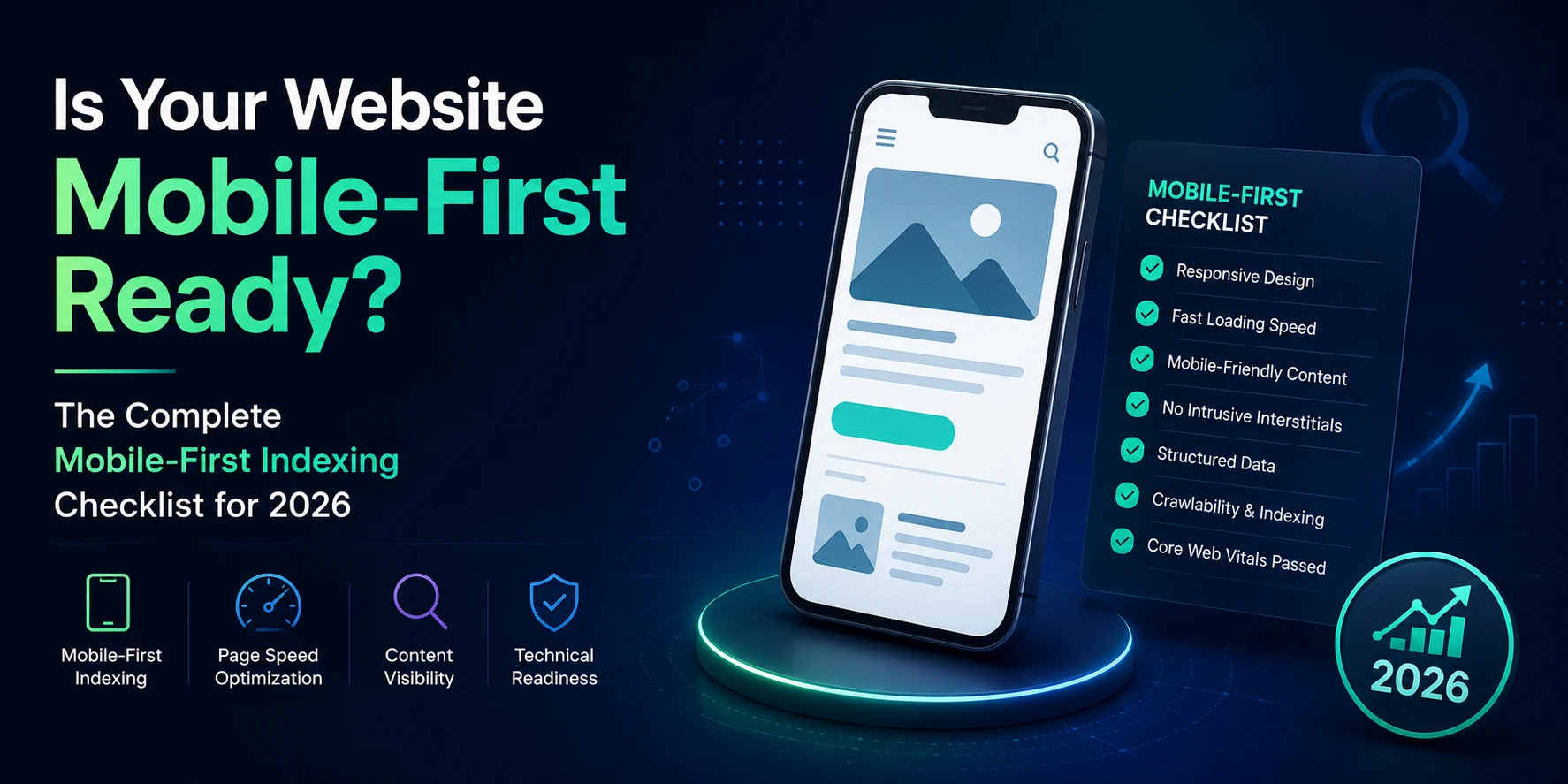
The Mobile-First Indexing Checklist
Run through these in order. Most of them take two minutes each.
1. Confirm Google is actually using your mobile version
Open Google Search Console, go to Settings, and check the Crawler section. If it shows "Googlebot Smartphone" as the crawler being used, your site is on mobile-first indexing. This is the starting point — everything else assumes this is already true, since virtually all sites have been migrated to mobile-first indexing by now.
2. Check for content parity between mobile and desktop
Open the same page on your phone and on a desktop browser side by side. Is all the text present on both? Are FAQs, tables, pricing details, and testimonials visible on mobile, or hidden inside a "load more" button or removed entirely? If your mobile page has less content, Google's understanding of that page is limited to what it can see on mobile — full stop.
3. Verify structured data matches on both versions
Make sure that both versions of your site have the same schema markup (review stars, FAQ schema, organization details). You'll often find that older sites have only added Schema Markup on their Desktop Site, as this was the site that was originally created. To make sure your site's schema markup is showing correctly on both the mobile and desktop versions, you should use Google's Rich Results Test and check both.
4. Test Core Web Vitals specifically on mobile
Using mobile PageSpeed Insights, run your URL and view the Mobile Page Speed not just the Desktop page speed. Mobile and Desktop Core Web Vitals (Loading Speed, Visual Stability, and Responsiveness) are measured individually for each version of the site. Generally speaking, Mobile Web Vitals will not perform as well because the average connection speeds and computing power of a mobile device are far lower than those of a Desktop computer.
5. Check that mobile links and navigation are crawlable
Test that the mobile links and navigation of your site can be crawled. Go through your primary navigation on a mobile device, if your primary navigation requires you to tap it to see the links beneath it, check that the links to those pages exist in the HTML of the structure of the page, and don't only load when you tap them. Google usually does not crawl your website in the same manner that users do, so any content only revealed via tapping may not get crawled properly.
6. Confirm image and video parity
Check that images on mobile have the same alt text and file names as desktop, and that nothing is being swapped out or removed to "save space" on smaller screens. Mismatched image URLs between mobile and desktop can cause temporary ranking drops while Google re-indexes the new mobile images.
7. Look for intrusive pop-ups and interstitials
Open your homepage on a phone. If a pop-up covers most of the screen before the user can see any content, that's a usability red flag Google has flagged for years. It's an easy fix and an easy win.
8. Check robots meta tags match across versions
If your mobile site has a different robots tag than your desktop site — especially a stray "noindex" — Google may simply skip indexing that page altogether. This is a common and costly mistake on sites with separate mobile (m.) URLs.
Mobile-First Indexing vs. Responsive Design: What's the Difference?
These two terms get mixed up constantly, including by people already working in marketing roles, so it's worth being precise.
Responsive design is one way of building a website — the same HTML and URL serve all devices, and the layout adjusts based on screen size. Mobile-first indexing is what Google does with whatever mobile experience your site provides, regardless of how it was built. Responsive design is the easiest way to satisfy mobile-first indexing because there's only one version of your content to keep in sync. Sites built on separate mobile URLs (like an old m.example.com setup) can still work, but they require manually keeping both versions identical — which is exactly where most parity mistakes happen.
If you're auditing a website and trying to explain this to a business owner, the simple version is: responsive design is the building method, mobile-first indexing is the rule Google applies to whatever gets built.
What This Means If You're Building an SEO Career
Mobile-first indexing checks come up constantly in real client work — and they come up in interviews too, because they're an easy way for a hiring manager to test whether you understand SEO fundamentals beyond keyword research. Being able to say "here's how I'd check if a site is mobile-first ready" and actually walk through it, rather than reciting a definition, is what separates candidates who've only studied SEO from candidates who've practiced it.
This is also one of the areas where structured, hands-on training makes a measurable difference, since textbook explanations rarely cover the messy, real-world cases — old m-dot URLs, mismatched schema, half-hidden mobile menus — that you'll actually run into on the job. If you're working through DizitalAdda's Expert Digital Marketing Course, technical SEO audits like this one are exactly the kind of live-project work built into the curriculum, alongside more conventional topics like keyword research and on-page optimisation.
If you're earlier in your learning journey, it's worth starting with the fundamentals through a course like Digital Marketing for Beginners before tackling technical SEO audits independently. And if interviews are coming up soon, it's worth reviewing common digital marketing interview questions alongside this checklist, since technical SEO questions are increasingly common in screening rounds.
Frequently Asked Questions
What is mobile-first indexing in simple words?
It sort of means that Google mostly checks the mobile version of your site to decide how your pages should show up, not the desktop version. And if your mobile page is missing stuff that the desktop page has, Google might just not realise that the content exists at all
How do I check if my website is mobile-first indexed?
Open Google Search Console, go to Settings, and check the Crawler stats section. If "Googlebot Smartphone" is listed as the crawler being used on your site, you're on mobile-first indexing.
Does mobile-first indexing affect desktop rankings too?
Yes. Because Google looks at your website through the mobile version, a weak or half-done mobile experience can pull your rankings down even for people searching from a desktop, since the ranking signals are collected from that mobile crawl.
Is responsive design required for mobile-first indexing?
It isn’t strictly mandatory, but it’s probably the simplest way to stay in line. Responsive design uses one content set for every screen, so you don’t run into the content mismatch issues that are pretty typical when you use separate mobile URLs
What happens if my mobile site has less content than my desktop site?
You risk losing rankings for the topics or keywords only covered in the missing content, since Google's understanding of your page is based primarily on what's visible on mobile.
Is mobile-first indexing the same as having a mobile-friendly website?
No. “Mobile-friendly” is mainly about usability, like readable copy tappable buttons, and no annoying sideways scrolling. “Mobile-first indexing” is about what Google uses for indexing and ranking you. You can be reasonably mobile-friendly and still fail a mobile-first indexing review if key content or structured data is absent on the mobile version
Want hands-on practice running audits like this one on live client websites? DizitalAdda's digital marketing courses include real technical SEO projects, not just theory. Explore our courses to find the right fit for where you are in your career.
About the Author
Sapna
Sapna is a Content Writer and Digital Marketing Specialist at DizitalAdda with over 3 years of experience in SEO, content strategy, and writing about AI tools and emerging search trends. She covers topics across digital marketing, search engine optimisation, generative AI, and career guidance for students and professionals looking to build a future in the digital space. Based in New Delhi.