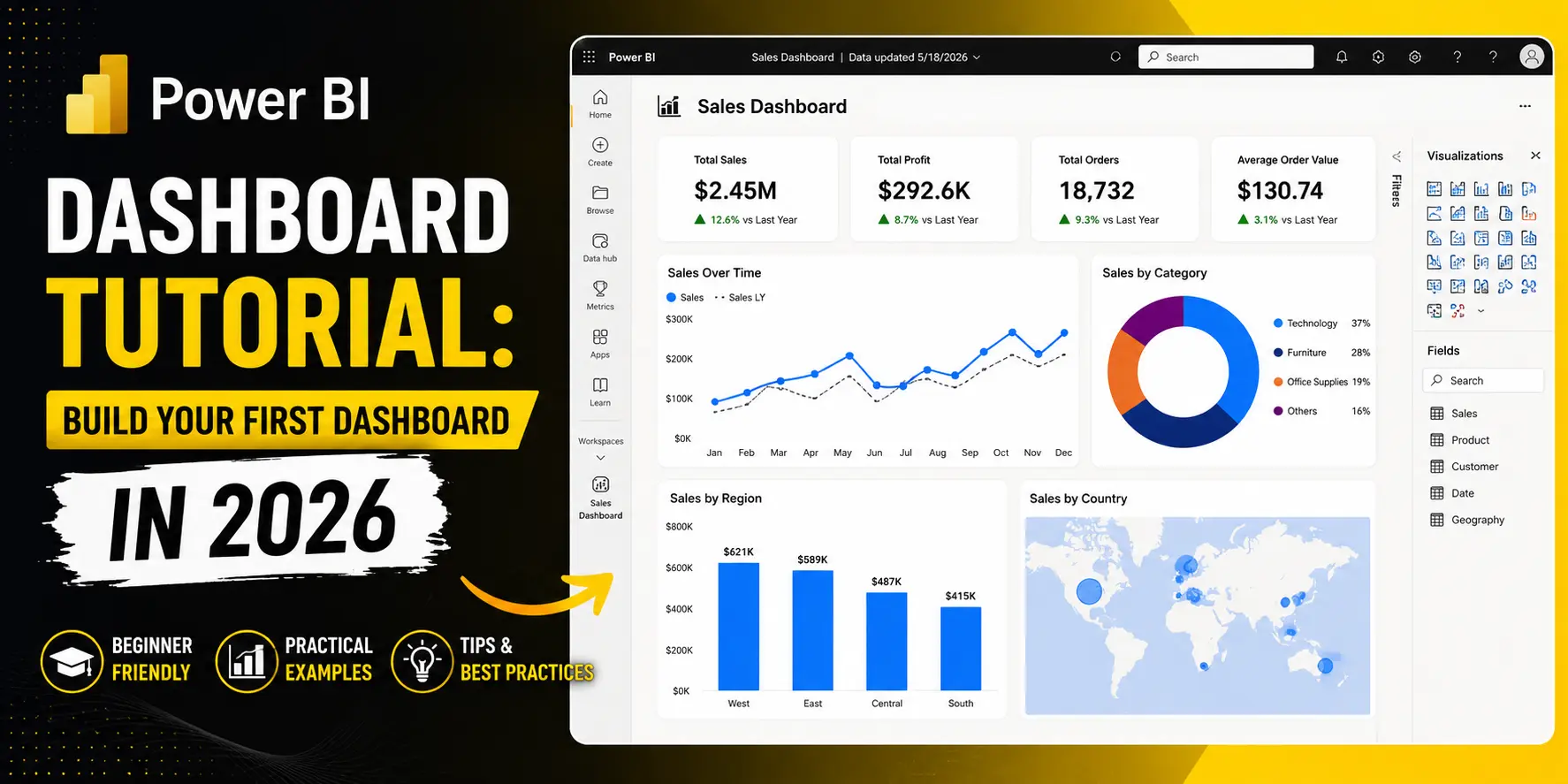
Power BI Dashboard Tutorial for Beginners (2026)
If you read our SQL guide and actually practiced a few queries, good — you're already ahead of most beginners. But a query result sitting in a results grid doesn't mean much to a manager who wants to glance at a screen for five seconds and understand what's happening in the business. That's the gap Power BI closes, and it's exactly why this is the next stop in the series.
The demand behind it is real and current, not projected. As of July 2026, Glassdoor was listing 951 open Power BI analyst roles in India — a live number, not a forecast. NASSCOM and LinkedIn's 2026 India analytics-skills reporting consistently places Power BI among the top five most in-demand analytics skills in the country.
And it's not hard to see why companies lean toward it specifically: Power BI's popularity in Indian businesses is tied directly to how cheaply and easily it plugs into tools they already use — Excel, Azure, and the rest of the Microsoft ecosystem — which is a genuinely different adoption story than, say, Tableau, which tends to show up more in larger enterprise budgets.
This Power BI dashboard tutorial walks you through building a real, working dashboard from scratch — no coding background needed, no money spent, just the free desktop tool and a sample dataset.
Why this is the natural next step after SQL
SQL gets you the right data. Power BI is what turns that data into something a decision-maker can actually look at and act on — a chart instead of a table, a trend line instead of a column of numbers. A typical, well-documented Power BI career path in India runs from Excel/MIS reporting work, into a Power BI Analyst or Developer role, and eventually toward Senior BI Consultant or Analytics Lead positions — which tells you something useful: this isn't a standalone party trick, it's a tool tied to an actual, progressing career.
One reassurance before we start: multiple 2026 sources agree that coding is not mandatory to begin with Power BI. Basic SQL and a formula language called DAX help later on, but you can build a genuinely useful first dashboard without writing a single line of code.
What Power BI actually does, in plain language
Think of Power BI as a translator between raw data and a five-second glance. You feed it a spreadsheet or a database connection, and it lets you drag and drop your way into bar charts, line graphs, maps, and cards — then arrange a few of them together on one screen so that a manager, a client, or you at 9am on a Monday can understand the state of the business without reading a single row of raw numbers.
Free vs paid — what you actually need to start
This trips up a lot of beginners unnecessarily. Power BI Desktop, the tool you use to actually build dashboards, is free to download and use, full stop. The paid tiers — Power BI Pro and Premium — only come into play when you want to publish and share dashboards across an organization at scale. For learning, practicing, and even building a genuinely useful personal or portfolio dashboard, the free desktop app is all you need.
Step-by-step: your first dashboard
1. Get a sample dataset
You don't need your own company's data to practice. Microsoft publishes free sample datasets specifically for learning Power BI — a "Financial Sample" workbook is one of the most commonly used, with sales figures across products, countries, and time periods, which is perfect for a first project.
2. Import the data into Power BI Desktop
Open Power BI Desktop, choose "Get Data," and point it at your spreadsheet. Within seconds, your columns show up in the Fields pane on the right, ready to use.
3. Clean the data in Power Query
Before you build anything, click "Transform Data" to open Power Query. This is where you rename messy column headers, fix data types (making sure a date column is actually recognized as a date, not text), and remove any columns you don't need. Skipping this step is the single most common reason beginner dashboards look "off" later.
4. Build your first visual
Drag a category (like "Country") onto the canvas, then drag a number field (like "Sales") on top of it. Power BI will suggest a visual — usually a bar chart — automatically. That's your first real chart, built in under a minute.
5. Add a filter or slicer
A slicer is a clickable filter sitting right on the dashboard — say, a dropdown of years or regions — that lets anyone viewing the dashboard interact with it themselves, instead of asking you to re-run a report every time they have a different question.
6. Combine two or three visuals into one page
This is where it stops being "a chart" and starts being a dashboard. Add a card visual showing total sales, a bar chart broken down by region, and a line chart showing sales over time, arranged together on one page. That combination — one page, several angles on the same story — is the whole idea behind a Power BI dashboard tutorial like this one.
A gentle first look at DAX
DAX is Power BI's formula language — think of it as the Excel-formula equivalent, just built for this tool. You don't need to master it to finish your first dashboard, but it's worth seeing one simple example so it stops looking intimidating:
Total Sales = SUM(Sales[Amount])
That's it — a "measure" that adds up every value in the Amount column. Nearly everything else in DAX builds on that same basic idea: take a column, do something simple to it (sum it, average it, count it), and give the result a name you can drop into any visual.
Common beginner mistakes in a Power BI dashboard tutorial like this one
- Importing every column "just in case." Only bring in what you'll actually use — extra columns slow things down and clutter the Fields pane.
- Ignoring data types. A date stored as text won't sort properly on a timeline, and a number stored as text won't total correctly in a chart.
- Cramming too many visuals onto one page. Three or four clear visuals beat ten cluttered ones — a dashboard that takes ten seconds to read has failed at its one job.
- Skipping slicers and filters. Without them, your dashboard is really just a static picture, not an interactive tool.
A realistic timeline
Building a single working dashboard, like the one in this tutorial, is realistically a weekend project once you sit down and follow the steps. Getting properly comfortable — clean data handling, a solid grasp of DAX basics, and building dashboards from messier, real-world data — is closer to a few weeks of regular practice, similar in spirit to the four-to-six week timeline we mentioned for SQL basics. There's no honest way to compress that further; steady practice beats a single long session every time.
What comes after Power BI
Once you're comfortable here, Python — specifically the Pandas library — is the natural next step, letting you automate the data-cleaning work that Power Query does manually. If you haven't already, it's worth going back to our SQL for Data Analysts guide first, since pulling clean data with SQL and visualizing it in Power BI is genuinely how most real analyst work happens, in that order.
If you're also weighing whether this whole path is worth the time, our guides on Data Analyst Salary in India 2026 and Data Science Jobs in India 2026 cover what the market is actually paying and hiring for.
FAQ
- Do I need to know coding to learn Power BI?
No. You can build a complete, working dashboard using only drag-and-drop features. DAX (Power BI's formula language) becomes useful as you go further, but it isn't required to finish your first dashboard. - Is Power BI free to learn?
Yes. Power BI Desktop, the tool used to build dashboards, is free to download and use. The paid tiers only matter once you want to publish and share dashboards across an organization. - How long does it take to learn Power BI?
A first working dashboard is realistically a weekend project. Getting comfortable with DAX and messier real-world data typically takes a few weeks of regular practice. - Is Power BI still in demand in 2026?
Yes — it's currently ranked among the top five most in-demand analytics skills in India per NASSCOM and LinkedIn's 2026 reporting, with hundreds of live openings on job boards like Glassdoor at any given time. - Can I really follow a Power BI dashboard tutorial with no prior experience?
Yes. This tutorial assumes zero prior Power BI experience — the only prerequisite is comfort with basic spreadsheet concepts (rows, columns, filtering), which most beginners already have from Excel.
Still confused? DizitalAdda's structured Data Analyst course is for you
If dragging fields around a canvas still feels more confusing than satisfying after this post, that's genuinely normal — Power BI's interface rewards a bit of guided practice before it clicks, and there's nothing wrong with wanting someone to walk through your first few dashboards with you instead of troubleshooting alone.
That's exactly what our Diploma in Data Analytics & AI is built for — SQL, Power BI, and Python taught together, in the same order real analysts pick them up, with a mentor reviewing your actual dashboards rather than a tutorial video that can't answer your specific question.
Practice this tutorial on your own dataset this week regardless — it's the fastest way to find out whether you want to keep going solo or want that structure from day one.