Flexbox vs Grid in Web Development Layout Systems
Flexbox vs Grid in Web Development Layout Systems: When to Use Which?
Have you ever wondered how a website is created? Right down to how everything is neatly arranged in rows, columns and sections, rather than just the text or pictures. Like how the menu stays at the top, photos are lined up in a gallery, or how buttons sit side by side on a form.
That neat arrangement doesn’t just happen on its own. Web developers use special tools to organize things. Two of the most powerful tools are called Flexbox and Grid. They’re part of something bigger called web development layout systems — and today, we’ll look at how they work and when to use which.
What Are Layout Systems in Web Development?
Think of a website like your room. You have a bed, a desk, a chair, a shelf for books — and each thing needs to be in the right place. You wouldn’t want your pillow on the floor or your books scattered around. That’s the job a layout system performs for a website — assist you in organising everything where it should be.
In web development, layout systems are the tools and rules we have for positioning the various pieces of a webpage — text, images, videos and so on — in order for them to look good and make sense.
The two layout systems we use most today are CSS Flexbox and CSS Grid. Let’s get to know them.
What is Flexbox?
Imagine lining up a row of toy cars or pencils on your table. That’s what Flexbox helps you do on a website — line things up in a row or in a column. It’s best when you want items to sit next to each other or stack nicely on top of each other.
Flexbox is great for things like:
- Navigation menus
- Rows of buttons
- Centering one item in the middle of the screen
It’s smart enough to know if the screen is big or small. On a big screen, it might keep items in a row. On a small screen, it might stack them into a column so they still look good.
You don’t need to worry about doing too much math or guessing how wide something should be — Flexbox does that work for you.
What is CSS Grid?
Now, imagine a chessboard — a big grid with boxes that go across and down. That’s what CSS Grid is like. It helps you design a layout with both rows and columns at the same time.
Grid is perfect for bigger designs, like:
- A full web page layout
- A photo gallery
- A blog with a sidebar and main content
If Flexbox is like lining up your books on one shelf, Grid is like organizing your whole bookshelf — with each shelf and section planned out.
With Grid, “you can say, ‘I want this part to go here, and this one to be two columns wide and that one to be at the bottom.’ You have total control over your placement of everything.
What’s the Real Difference Between Flexbox and Grid?

So, how do you know which one to use?
It comes down to direction and purpose.
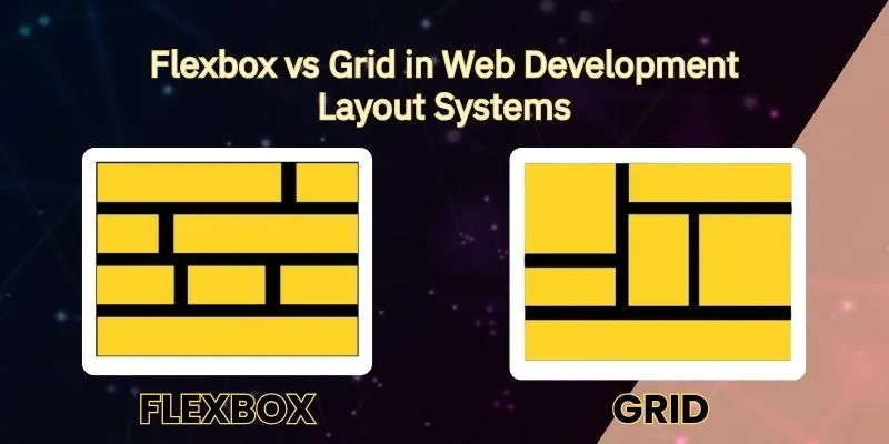
- Flexbox is one-dimensional. You use it when you’re placing things in a line — either across or down.
- Grid is two-dimensional. You use it when you want a full layout — across and down — like a checkerboard.
Think of it like packing a lunchbox:
- Flexbox is like placing a sandwich, juice, and cookie in one straight row.
- Grid is like dividing the lunchbox into little sections for different snacks.
Both are useful. You just use them at different times.
When Should You Use Flexbox?
If you’re building a simple part of your site — like a header with menu buttons — Flexbox is your best friend. It’s quick, flexible, and easy to use. It’s also great when you want to center things or space items out evenly.
Flexbox is also handy for small areas inside a website. For example, if you have three small cards that show different features of your product, Flexbox can line them up beautifully.
And the best part? It works really well on phones. If your screen gets smaller, Flexbox can adjust the items so they still fit and look nice.
When Should You Use Grid?
Grid is for the big picture. If you’re building a whole webpage layout — like a blog, an online store, or a portfolio — Grid is the better choice.
You can create sections for a header, sidebar, content, and footer — all with neat spacing and alignment.
Let’s say you want four pictures across the top, some text underneath, and a button in the corner. Grid lets you place all those parts exactly where you want them.
It’s like building with Legos. You snap each piece into place until your layout is just right.
Can You Use Both Together?
Yes! And many developers do.
Think of Grid as your floor plan — the big map that shapes the structure of your webpage. Then inside each section, you might use Flexbox to arrange smaller parts — like lining up icons, buttons, or pictures.
They don’t fight with each other. In fact, they work really well together. That’s why it’s great to learn both.
Why Should You Learn Layout Systems?
Good layouts are what make websites look simple and easy to use. If things are everywhere or impossible to find, people won’t linger. But if your design is orderly and user-friendly, people will be drawn in to your site.
These things are actually good (albeit new) and dare I say, enjoyable to learn, in the case of modern and relatively powerful paradigms such as Flexbox and Grid. When you know when to use what, creating websites is a lot easier, and a lot more fun.
Even if you’re a beginner, mastering these layout tools can get you to next-level ability for making beautiful pages without graduating to graphic-design expert.
Want to Learn Web Development From Scratch?

If you're curious about building websites, there's a great place to start — Dizital Adda.
They offer a Web Development Course made just for beginners. You’ll learn:
- How websites are made
- How to use Flexbox and Grid step by step
- How to make websites look good on phones and computers
- And how to build real projects, not just theory
All is presented in a clear way, with examples and straightforward language. Whether you are a student, a novice, or an inquisitive novice, this course is an ideal starting point.
👉 You can check it out at Dizital Adda and start learning today.
Wrapping It Up
So, let’s keep it simple:
- Use Flexbox when you’re lining things up in one direction.
- Use Grid when you need a full layout with rows and columns.
- Combine both when your project needs the best of both worlds.
Understanding web development layout systems is like learning how to organize your stuff. Once you know where everything goes, building websites becomes way easier — and a lot more fun.
Now that you’ve learned the difference, go ahead — try building something small. Play around. That’s the best way to learn.
And who knows? This might just be the start of your journey to becoming a web developer.